black dog DESIGNS is an energetic marketing agency that’s having fun and being effective. Delivering graphic design, web design, labeling/packaging design, and strategic campaign development we help take our clients reach their next goals. We work together with you to find solutions that best fit your needs and give you the tools to take your business to the next level. Choosing an agency isn’t easy. Working with us is.
When a customer walks into a store looking for beer, how do they decide what they want? If they don’t already have a specific beer in mind what triggers their senses to pick up yours? Is it the beer style? The color palette? The name? The truth is that every beer drinker has their own reasons. Knowing your specific target audience and what appeals to them will help you grab their attention in a crowded marketplace.
Labeling and packaging is one of the final things a customer sees before purchasing, and for that reason they are a highly important extension of your brand. With brand strategy in place you know exactly who your ideal customer is, why they choose you, and how you’re different. Visually appealing labeling and packaging engages customers, encouraging them to buy. If your labels or packaging don’t align your customer’s interests with your brand identity and messaging it will be difficult to create a connection. This connection will get customers to grab your beer off the shelves and leads us to the next objective of your labeling and packaging. Communicate.
So a potential customer is now holding your beer in their hand. You’re almost there! You have the ability to communicate a large amount of information to customers. This is your last line of marketing communication before they make a purchase decision. Does your beer description align with the visual identity, the taste of the beer, and jump out at the beer holder? This is your opportunity to make your final sales pitch.
If you’re interested in seeing how this all comes together keep reading below to see some examples!
Oyster Bay Brewing Company
Oyster Bay Brewing Company has been producing unconventional ales and lagers that defy styles, categories, and your imagination since opening in 2012. For those of you unfamiliar with the area, Oyster Bay is a historic town on Long Island’s Gold Coast. One of the goals of our design process was to begin to develop cohesiveness for their core beers and capture the town’s identity within the labels. In addition to their core beer line, Oyster Bay also was looking for unique can designs for their specialty beers: The Barn Rocker Ale, and Alexa IPA. Check out the final designs below and stop by their brewery to enjoy a nice pint!
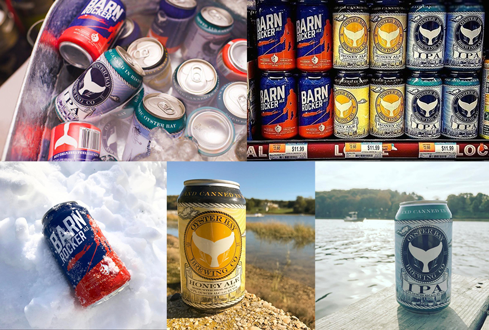
LEARN MORE – https://blackdogllc.com/portfolio_page/oyster-bay-brewing-company/
Paradox Brewery
For many craft beer drinkers, the “lifestyle” is very important to them. They don’t just enjoy the beer. They enjoy the setting they consume it in, and the people they drink it with. Paradox Brewery out of Schroon Lake, NY embodies the Adirondack lifestyle in everything they do. We’ve worked with Paradox on their Forever Wild Series, Barrel Series, Specialty Series bottles as well as their cans. Each bottle series has an sketched Adirondack feel, incorporating contour lines, trail signs, and Adirondack Park icons. These create an upscale, elegant vibe while giving a unified identity to viewers. We swapped out the color palettes and copy per individual beer, and graphical elements between each series. This has really nailed down a unified identity for them that aligns with their customer’s interests. Their cans feature a brighter design using the contrast of the can’s natural silver color and white for the trees.
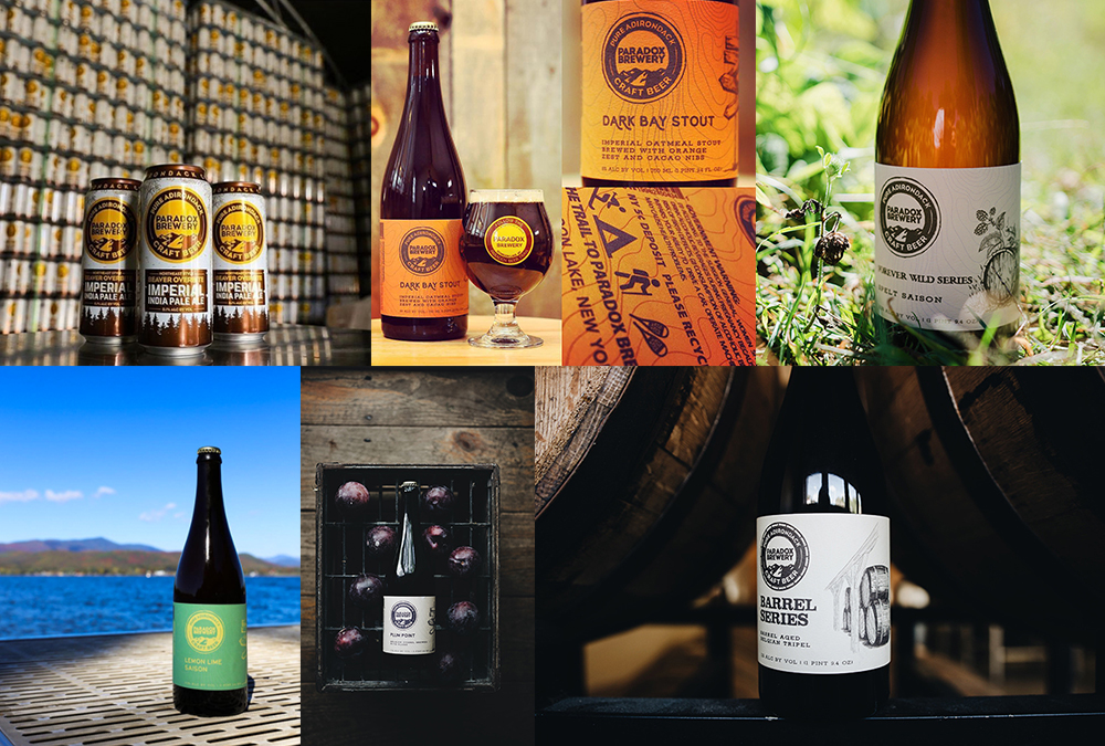
LEARN MORE – https://blackdogllc.com/portfolio_page/paradox-brewery/
Common Roots Brewing Company
Common Roots Brewing Company, just down the road from us is another client we’ve had the wonderful opportunity of working with. Great tasting beer has always been a part of this family owned brewery. Common Roots mixes old world traditions with new world inspirations, and the result is an eclectic collection of beers and design styles. From their table series bottles to their newly released cans and everything in between, we’ve used a variety of design styles to match their beers. Ramping up production lately, Common Roots is also canning multiple beers of theirs.
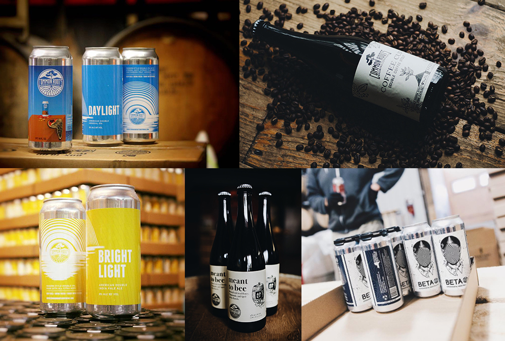
LEARN MORE – https://blackdogllc.com/portfolio_page/common-roots-brewing-company/
Springbrook Hollow Farm Distillery
While not in the beer world, Springbrook Hollow is an upcoming distillery in Queensbury, NY. We’ve worked with them most recently on their Adirondack High Rye Bourbon featuring a sketched Adirondack style. This complimented their brand, as their Bourbon is “hand made in the Adirondack mountains with pure unprocessed spring water.” For the Apple Moonshine, we made an incredibly artistic label drawing off of the apple, moon, and nature as inspiration. We continued the same mind set for the Maple and Moonshine and kept the design consistent.
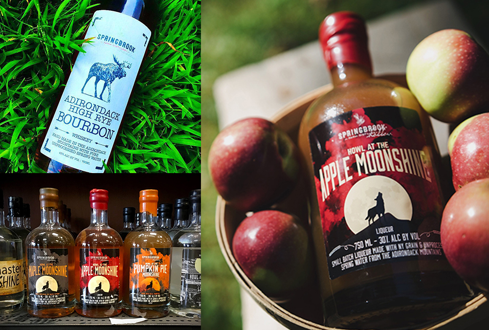
LEARN MORE – https://blackdogllc.com/portfolio_page/springbrook-hollow-distillery/